Postal Sounds
Enjoy music, avoiding tourist traps.
Solo-built full-stack sustainable music tourism platform, from open brief to live product.
Context
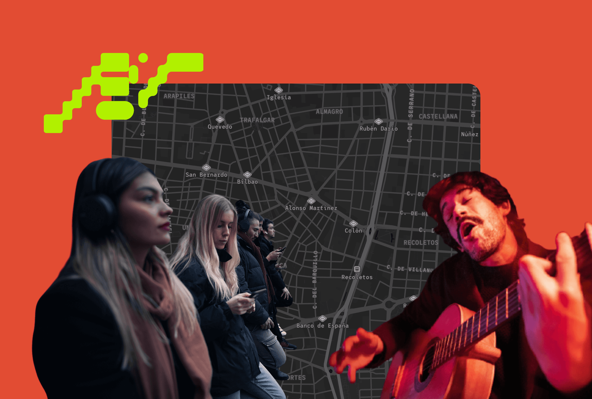
Postal Sounds is a curated map and web platform that lets travelers discover a city through its music scene: specific spots, events, and local businesses tied to genres like flamenco or 80s underground rock. The pitch is a more sustainable, locally rooted alternative to generic tourism, pointing people toward real places instead of the usual circuit, and pushing back against gentrification along the way.
Team: Founders + me
My role: build a live, self-sustaining platform. I led product strategy, architecture, design, and implementation.
Tools: Framer, CMS, Database Design, Cartographic data tools.
It launched with early users in Madrid and Barcelona on a freemium model, with an official launch planned for early December.

Challenge
The founders came to me with three feature ideas. There was no technical strategy behind it yet, no sense of what platforms could actually support it, and no clarity on what a first version needed versus what could wait. It became a process of translating ambiguity into different work streams.

Every session with the founders was as much about asking questions they hadn't asked themselves yet as it was about listening.
"What is the company trying to prioritize for this first launch, what does "done" look like for launch versus later? What critical mass of content does this need before two cities feel like a real platform instead of an empty shell?"
Underneath all of it sat a harder constraint: this had to be built by one person, within a reasonable budget and timeline, and it had to work for two very different audiences. Travelers browsing the platform, and founders who would need to run it themselves once I was gone.
Approach
I acted as strategic partner, project manager, and hands-on builder across every layer: frontend, backend, data structure, and content.
Architecture
I mapped out which tools could realistically be stitched together by one person to cover the full scope: Framer as the core platform, integrated with plugins for customer profiles and connected to a payment gateway. Mapbox for the actual interactive maps, with a custom visual language and iconography. This became the technical backbone with certain constraints, but allowed independency from engineering roles.


Content and flows
I wrote the site copy and value proposition within the founders' existing brand book, then mapped every access flow the platform needed to support: free users, paying subscribers, private access, locked subpages. What looked simple on paper turned out to hide a lot of complexity, particularly around login and signup, which became one of the more demanding parts of the build.

Maps and routes
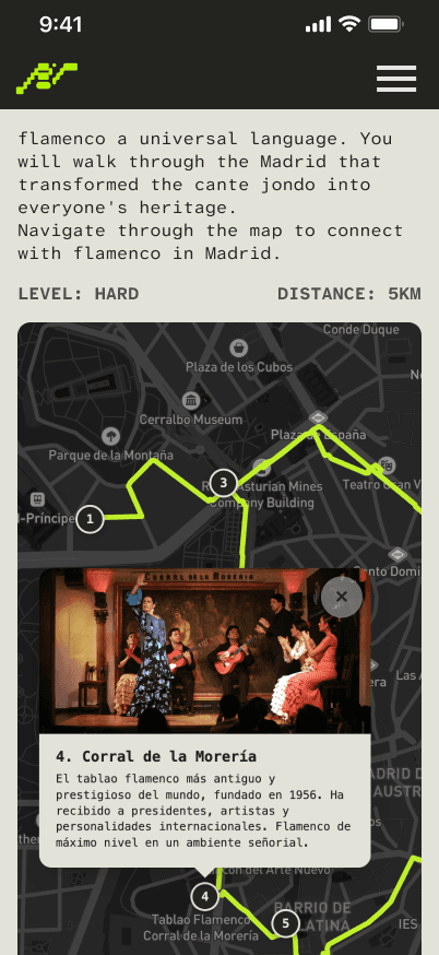
Maps in general have several spots that are categorized. People can navigate freely around, learn certain details about them and visit them if necessary.
Curated routes (a flamenco walk, an 80s underground rock trail) needed their own embedded map, title, description, image carousel, and playlist, all rendering consistently, and all working on mobile first, since travelers don't carry laptops.
Data collection for spots and routes


An interactive prototype (Madrid & Barcelona)
Where it landed
The founders ran beta testing with a close group of early users and started hosting workshops where the community built their own routes, building momentum ahead of the official December launch.
Since then, entirely on their own, they've added new spots to the maps, created new routes, etc. These capabilities were built with a few basic tutorials, a backend for geolocated spots built on Google Spreadsheets, and a CMS collection for posting the general information about routes.

Takeaways
Ambiguous asks are the actual work, not a blocker to it. "We want an interactive map" isn't a spec. Getting from there to a buildable system meant asking questions the founders hadn't asked themselves yet, some of which were useful enough to carry into their own mentor conversations.
A system should outlive its builder. The real test of a 0-to-1 build isn't the launch, it's whether it can be improved and refined afterward without becoming dependent on one developer, technical or not. Choosing a spreadsheet over a database as the content layer was a design decision, not a shortcut.
Scale is a decision you make on day one, not a fix you make later. Building on the assumption of multiple cities and languages from the start, even while launching in just two cities, is what let the founders add English and new routes themselves without needing to rebuild anything underneath.
Depth across every layer is what makes translation credible. Being fluent enough in frontend, backend, data structure, and content to actually know what was feasible is what turned "let's figure out what you need" from a diplomatic exercise into an architecture the founders could trust and eventually run themselves.
Results
<3 months
from idea to implementation
+300 spots
curated and mapped
3 revenue streams
designed to find product market fit
© 2026 Enrique Peralta. All rights reserved.